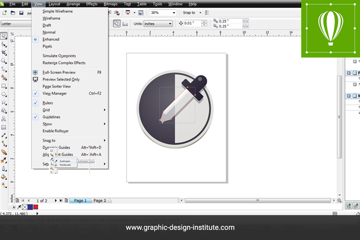
Whether you’re new to vector, or you’re an existing Adobe Illustrator user expanding your vector horizons, learning the basic tools of CorelDRAW is a worthy task. The best way to acquire skills is by joining CorelDraw training institute in Delhi where you will use different features and tools of CorelDRAW software. With this tool, you will learn how to use this vector-illustration and page-layout application to present objects, layers, and pages in an effective and presentable form. A huge assortment of fonts, clip art, and editing tools enables the user to create logos, brochures, website graphics, illustrations and other artwork. To speed up your work can also learn to memorize CorelDraw shortcut that you can learn in Corel Shortcut set. In this blog, we are going to talk about important Eyedropper and Fill Tools in CorelDraw.
Eyedropper and Fill Tools in CorelDraw
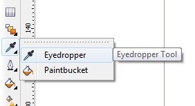
The Eyedropper and Paint bucket tools work together to make adding color fills quick and easy. You use the Eyedropper tool to sample or pick up the desired color, fountain, pattern or texture from an object that’s already filled. Paintbucket tool is used to apply the color, pattern, or texture to fill a different object.
What is Eyedropper tool?
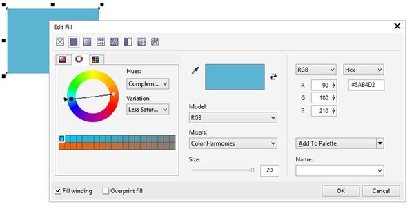
Eyedroppers toolsare mostly used for picking the colors and collect the sample of colors, the eyedropper tool in CorelDRAW can sample a lot more properties besides the color and such as applied the line style, skew, rotation, effects applied to the object and fonts for text objects and the main purpose of the Eyedropper tool is that pick the color hue and saturation. And the same uses of this tool in Adobe’s Software. And no there in this software short command of Eyedropper tool.

How to use the Eyedropper and paint bucket tool menu?
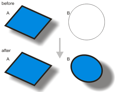
These tools will permit you to copy properties from one object to another. Click on an object A with the eyedropper tool to sample its properties collect the sample and next take the paint bucket tool and click on another object B to transfer the A sampled to applied the properties to B.

- Although eyedroppers tools in graphics software are mostly used to sample colors, the eyedropper tool in CorelDRAW can sample a lot more properties besides color; such as line style, skew, rotation, effects applied to the object and fonts for text objects.
- You can select the properties which are sampled and transferred with the active property bar.
A quicker way to transfer some basic properties from one object to another is to right click on object A and while holding the right mouse button, drag and drop object A on object B. When you release the right mouse button a menu will appear with a few options select “copy fill here”, “copy outline here” or copy all properties” to transfer fill, outline or all properties respectively from object A to object B.

Interactive Fill Tool and Interactive Mesh Fill Tool
The interactive fill tool allows you to add the same fills to objects as the normal fill tool, but in an interactive way you set the fills properties in an interactive way. This is especially useful for fountain fills.
Interactive Fill Tool
- Applying a fountain fill with the interactive fill tool
Just click and drag on an object with the interactive fill tool. The object will be filled with a fountain fill from the objects color to white and drag the interactive fill tool then adjust the level for requirement. The direction of fountain fill is determined by the direction in which you dragged the mouse.

- Making a fountain fill with the interactive fill tool
You can edit the fountain fill by dragging the two squares, to change the direction and position of the fountain fill. You can change the colors used for the fountain fill in the property bar. You can also drop a new color from the palette onto one of the squares, to change the color. If you drop a color on the line between the squares, the color will be added to the fountain fill new color.
Besides linear fountain fills, there are other types: radial, conical and to change your linear fountain fill into another type of fountain fill, select it from the active property bar. The behavior of the squares changes slightly between the different types of fountain fill, but in general it works the same for all types.
- Applying other fills with the interactive fill too
When you select an object with the interactive fill tool, you can apply other fills than fountain fills, with the active property bar. Pattern, texture and postscript fills are available from the drop-down menu in the property bar.
With these fills, less properties can be set interactively, most properties are set through the active property bar. When you apply such a fill, a dotted rectangle appears, with 4 marker symbols. These symbols allow you to set the size, rotation, skew and displacement of the pattern tiles interactively. Increase the size of the square by dragging the top right (circle) marker, increases the pattern size. The two squares on the sides allow you to skew the pattern. And dragging the center marker displaces the pattern as a whole.
Skewing a brick pattern makes a nice dolomite

Interactive mesh fill tool

The mesh fill is a very complex kind of fountain fill, whereby the blending colors’ distribution is not limited to lines. The colors can be anywhere inside the object. When you select an object with the interactive mesh fill tool, it will become overlain with a mesh lines and nodes. You can drag and drop colors from the palette onto zones or nodes of the mesh.
The colors will automatically blend with the other colors in the mesh. The mesh itself can be node edited, to make allow for a more precise distribution of the colors. This is a complicated tool, which requires some practice, but can achieve impressive results.
Hope now you have understood the usage of Eyedropper and Paintbucket tools. These tools work hand in hand. The eyedropper tool can pick up colors from any object inside the CorelDRAW! environment as well as outside the environment. It can also pick certain fills and outlines, as well as special effects such as drop shadows and transparency. The picked-up effect or fill is then applied with the Paintbucket tool. The best way to learn them is by implementing them in your designs and see the difference.
If you want to learn more about these Eyedropper and Fill Tools in CorelDraw and interested in learning new innovative techniques and advanced features in the application, then you should join training under graphic design courses in Delhi to get certified with live projects by industry expert.


