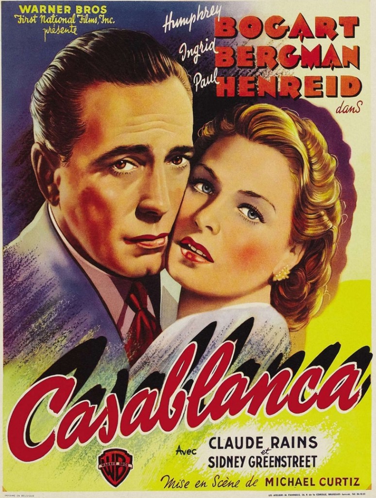
When talking about a page layout, graphic designers often employ distinguished layouts according to their preferences. Types of layout can be classified as magazine layout, advertising layout, static, dynamic, adaptive, or responsive.
In case you’re a graphic artist, user interface designer for websites, interior designer, fashion designer, or motion graphic artist; you ought to have a sound understanding of these terms i.e. what they mean and when each type of layout should be used.
Types of Page Layout for Designers
Broadly page layout can be classified in 10 categories as:
Now let us give you details about these different types of graphic layouts in details.
1. Mondrian Layout
Mondrian layout refers to the forms: of square, landscape, or portrait, where every field is parallel to the presentation field and loads the image to form a conceptual composition.

Uses of Mondrian Layout
When your design needs a conceptual composition about a topic or a story through text and images, which further shows a strong mood. It can be used in any of the designs where one need balance and easy screening of the design elements by the reader.
2. Circus Layout
Circus Layout doesn’t imply standard layout. It refers to the irregular composition of elements.

Uses of Circus Layout
Very powerful layout when you as a designer want to express feelings of crowd, groups, irregularity, busyness, chaos etc. It is very good for schools magazines, exhibitions, entertainment etc.
3. Multi Panel Layout
The multipanel layout is divided into various sections or themes in the same shape such as rectangle, square, cube, etc.

Uses of Multi Panel Layout
It is one of the commonly used design layouts. You can arrange your content like pictures and texts putting them in clear blocks here. Very useful for education, sports, and youth related designs.
4. Silhouette Layout
Silhouette layout refers to the layouts in the form of illustration or photographic technique, highlighted only through shadow. Presentations can be shaped text-rap or spot color illustration or refracted smooth image pickup along- with photographic techniques.


Uses of Silhouette Layout
Looking for a classical feel, must go for Silhouette layout. As you know it uses shadow techniques so main objects get highlighted automatically, in result it is a very useful layout for getting attention over important objects quickly. It adds a good amount of suspense in your designs because of the shadows used in it.
5. Big-Type Layout
Big-Type layout lay emphasize on the font styles and big font sizes so as to grab the attention of the audience. Big-type layouts are usually used for creating headline.

Uses of Big Type Layout
It is a suitable layout for creatives if you don’t have huge text to adjust in your design. Big types in your design offers a sense of richness and creativity and adds a feel of spaciousness. It is very useful for artistic and minimalist designs.
6. Alphabet Inspired Layout
Alphabet- Inspired Layout focuses on the arrangement of letters or numbers in an appropriate sequence or forms a word or enhanced to give an impression of story or an idea for the advertisement.


Uses of Alphabet Inspired Layout
First choice of artists and creative people is this layout as it offer a scope to play with texts using all of your creativity and knowledge of typography. Use it in creative designs like print ads, web ads, and posters with less text or copy.
7. Copy Heavy Layout
A Copy-heavy layout generally includes a lot of text. This kind of text is mostly used in magazines, newspapers, and websites. Designers need to follow a good hierarchy, spacing, color, and typography while working on this layout.
Some examples are:
- Newspapers
- Magazines
- Brochures
- Online Journals
- Brochures etc…

Uses of Copy Heavy Layout
As its name suggests and mentioned above, this layout is the best fit for the designs where you have huge copy or text like Websites, Magazines, newspapers, etc.
8. Frame Layout
Layout with story or images with story in the frame.


Uses of Frame Layout
Whenever you need to put your content in a frame in your designs, use it like certificates, ads, posters, website UIs etc. It provides an organized and balanced feel due to the border around it, which further suggests a feeling of satisfaction and calm. Frames suggest authenticity too.
9. Picture Window Layout
A vertical layout style characterized by a large picture at the top with a headline and body copy below.


Uses of Picture Window Layout
It is a quite modern techniques of making designs. It gives a feel of modern, fulfillment in contrast with tradition layouts. We would suggest you to use when you need to add an element of modernity and busyness both.
10. Rebus Layout
Layout shown text and image. The layout forming a story.

Uses of Rebus Layout
You replace texts with images which make sense and improve the readability. It adds an element of surprise sometimes, and make designs rich. So use it when you need to add richness and surprise elements in a design. Surprise elements enhances readers focus and attention.
I hope this effort of our institute is helpful for you and you learned a lot or less about types of layouts related to web and graphic designing. I expect your feedback and doubts if you want to share with me in comments.
Thanks for reading this post.


I love this site, it helps explain it so nicely doesn’t leave you questioning like half of what you just read. Also I love when their is images helps explain it detailed what words can’t.
Good perspective
Can you be more specific about the content of your article? After reading it, I still have some doubts. Hope you can help me.